A logo design should always be a vector… unless you have a good excuse!
When designing a logo you should always create a vector format of the logo. Why? There are numerous benefits to working with vector based software such as Adobe Illustrator, and here’s a few of them:
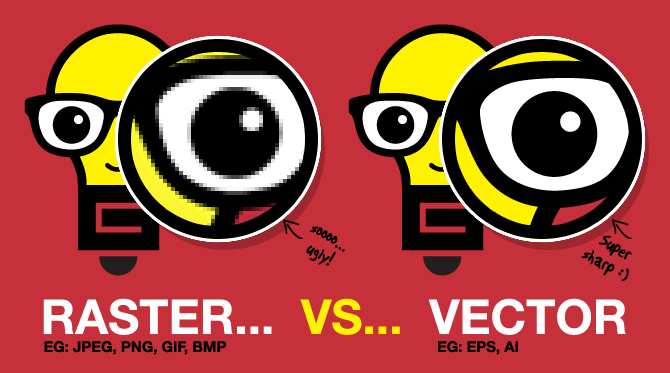
- Since vector graphics are based on paths, points, lines, cures and shapes using mathematical equations, it means they can be scaled indefinitely without any loss of quality.
- The file size remains small.
- When exporting out low resolution PDF files from InDesign the logo remains sharp.
- Easy to reproduce in various business situations such as: Print, Vinyl’s, Embroidery etc.
- Easy to modify and update when necessary.
With a recent project I’ve worked on I had good reason to break the rules… I decided to use Photoshop instead. The problem with raster based software such as Photoshop is that the images are built up from pixels. This means the image will loose quality as you scale upwards. You can of course make your logo images very big, but this leads to large files and endless reproduction issues long-term.
Logo design in Photoshop… err?
So why did I decide to use Photoshop instead when its such a bad idea? Let me explain… A few years back I started working on the biggest personal project of my life so far – a smart phone game called GooHoo. I came up with an idea, discussed it with some friends of mine who could bring it to life, and we set ourselves on a big adventure! I started designing characters from the outset, and very quickly had a design in mind for the lead character known as GooHoo. As you can see from the images below GooHoo is a translucent jelly type blob of goo…

Shortly after designing the character, I wanted to design a logo for the game. I had a set idea in my head from the start… I wanted the logo to be as translucent and gooey as the lead character. The problem with illustrator is that its a pain to play around with effects. Unless you know exactly what you want to achieve with the effects I find it ‘tedious’. Illustrator is superb for illustration work, so lends itself well to typical logo design, but if you want to do the type of thing I had in mind and experiment a little, its exhausting and just not fun…
The beauty of Photoshop however is the tools give you the ability to easy manipulate images, allowing you to quickly create textures, finishes, patterns, paint and modify to your heart consent. You can experiment and play with no restrictions.
The great thing with this project is that the design was for me – I was the client. I knew the impact of my decision, and I was prepared to make any sacrifice as I knew how the logo was to be used. It was meant for screen use only. The logo will only ever be seen on phones, tablet computers and websites. This also meant I could get away with a lot in terms of colour. I could focus on using RGB colours only, meaning I could use bright colours, and not need to worry about its CMYK counterpart.
The brief allowed me to break the rules. Below is the final GooHoo logo design I created. Now its complete, its certainly possible to create this as a vector, but my design took experimentation and modification in Photoshop to get it right and I don’t believe I could have achieved the same results in Illustrator alone. Now the design is finalised if needed I can easily replicate the design as a vector anyway for future use.

GooHoo has been a mammoth project, and I am proud to say its now officially released and available for iPhone and iPad free of change. Grab yourself a copy here: https://itunes.apple.com/gb/app/goohoo/id602069428?mt=8
Here’s a small sample of the graphic design work I did for the game. Would love to know what you think!


 Have you designed a logo in Photoshop instead of Illustrator? Do you have a story to tell, good or bad? Share your comments and stories below.