An in-depth look into the logo design process for Minternet
I’ve always been a fan of reading through the design process of other identity designers, as I find it both inspiring, and educational, so I have put together a version of my own which covers in-depth look into the creative process for a recent logo design I have created for Minternet, the Web Design and Development company from Mike Munro. I hope this will help others learn logo design.
Defining the creative brief
At the start of every design project I work closely with the customer to create a list of objectives which the final design must meet. This is agreed and signed off by the client before the project commences.
I create this list for 2 reasons:
- Firstly this list is created so that I can focus my research and creative ideas. By understanding the business and audience in detail I can ensure I represent the business and design the logo to target the desired audience. I can refer to this list throughout the process, and question every design decision I make. When presenting the designs to the client I’m able to clearly discuss my design decisions giving confidence that the logo will, to the best of my knowledge, perform for the business.
- Secondly I am able to ensure that both myself and the client are on ‘the same page’ from the outset. Although its important that a client likes the final design, it’s important that they understand the purpose of the logo and what its aiming to achieve rather than simply making their choice based on how it looks. By asking the client to agree this list I can be confident that I get no ‘unexpected’ surprises after spending hours creating ideas; should this happen I have a firm leg to stand on if I need to create further designs with different goals. I’m essentially protecting myself.
Mike has kindly allowed me to show the list of objectives, which are listed below:
Minternet Logo Design Objectives:
- To design a logo for Minternet Web Design
- Where required to include the tagline “Fresh, Clean, Crisp Web Design”
- To represent a sole trader, who works with, and has a passion for web design and development.
- To represent a social individual who supports the design and development community.
- Where possible promote a professional individual who is happy to discuss requirements face to face, and to listen to and respect clients input and ideas as part of a collaborative service.
- To promote a business with a transparent and honest service.
- Where possible promote the unique personal history of being a part-qualified architect.
- To target individuals who are looking for a cost effective, comprehensive web design service.
- The design must work well both online, through social media and website, as well as offline through promotional materials.
- The design must be simple, elegant, clean and minimal to fit Minternet design ethos: “Fresh, Clean, Crisp Web Design”
- The design must not be loud, bright, busy or cluttered.
- Where possible the design should promote the following words: Professional, friendly, timely, competitive, ambitious, relevant, enthusiastic, accessible, creative, knowledgeable, informed and skilled/talented.
- Focus on Attention to detail: A core focus of the business ongoing.
Sketchbook: The Discovery Phase
My design phase is fairly organic, and varies slightly per project, however I always start with a sketchbook exploring ideas. I like to call this my discovery phase, as I am ‘discovering’ ideas and concepts. Although I explored several design concepts during this stage, I will focus primarily on the evolution of the logo which ultimately became the final design for Minternet.
I wanted to explore concepts which represented communication between Mike and his clients, as well as with the creative community as I feel this is one of the strongest differentiators. I started by thinking to myself: what is a basic visual representation of ‘communication’? It didn’t take long to work out a solution: two arrows coming together. This shape also has the potential to work well as a monogram for Mike and his business.
By overlapping the two arrows I discovered a further visual idea. The overlap forms a diamond which strengthens the concept: Only by communicating together does a perfect ‘diamond’ solution appear. Working in my sketchbook I explored several variants of this idea, attempting to work out ways of using this concept, whilst also creating a monogram.
At this stage although I was not completely satisfied with any of my sketches, I felt I had discovered a strong enough concept to explore further on the computer.
![]()
As you can see from my sketches above, I work quickly and roughly. These sketches are (normally) for my eyes only, and purely for the purpose of idea generation. Any idea that comes to mind I put on paper, even if it seems bad at the time, as sometimes even a bad idea can form an interesting concept. By putting every idea down on paper frees my mind to think of further ideas, so the faster the sketches, the quicker the next idea starts to form.
Working in Adobe Illustrator
From my sketches I select concepts which I would like to explore further and refine in Illustrator. Although working on the computer, I’m still at this stage working relatively quickly. Once I have a solid idea I’m happy with I can polish and refine accordingly.
Below are some of the ideas I initially explored. I work in black and white at this stage as I am focusing on the concept and form, and will apply colours later on. As you can see I was working with overlapping arrows, and with each refinement aiming to make the shape look more like a Monogram of the letter M. Some ideas which worked well on paper felt weak once more refined, and in some cases as the shape resembled an M, the original concept broke down.

I liked the idea of overlapping right angled shapes as it clearly resembled an M, but the overlapped shape, a triangle, lost the concept of the revealed diamond. Regardless of this I briefly explored the idea before disregarding it as a potential direction.

By overlapping the right angled shapes, then assigning an outer stroke, by happy accident I realized that at it’s center a diamond is revealed. What’s even stronger however in this case is that the diamond shape sits on a pedestal. This was an exciting moment for me as an idea I was close to abandoning become one of the strongest ideas, and was the option I wanted to explore further.
By polishing and refining the shape, I discovered a further shape within the negative space, which resembled a funnel with arrows splitting in different directions. This negative space worked well to symbolically represent the internet. By putting the shape into its own ‘box’ the negative space becomes visually stronger.

This icon worked well to represent Mikes business in several ways:
- The overlapping arrows represents exchange of conversation with client and the web community.
- The use of right angles represents Mikes personal history of being a part qualified architect.
- The negative space represents the internet and web development.
Selecting a typeface
I started to look for a supporting font which worked well with the design. I knew in order to work with the icon this needed to be a sans-serif font which was sharp, crisp and solid in appearance. A font which worked well was a font called Le Havre Layers, however it needed to be subtly modified to work in harmony with the icon.
The ‘M’ was my main concern as the angles didn’t work well with the icon. This needed to be straight. I also modified the spacing manually, and refined the height of some of the letters to keep everything uniform. Below is a before and after example showing the modifications.

Refining the logo layout
At this stage I have a near complete design, however the sizing and layout needs to be well balanced and proportional. The final design is presented below, with grid lines showing how layout decisions were made.
![]()
Selecting a colour palette
I wanted to select a colour palette which represented Mikes design ethos: “Fresh, Clean, Crisp Web Design”. I also wanted to find a colour which worked well within a business environment, but remained personal honest and friendly. I explored various colours, however the strongest colour choice which reflected my requirements was a carefully selected turquoise green. Combining this with a charcoal grey allowed the identity to feel very professional, modern, yet friendly and approachable.
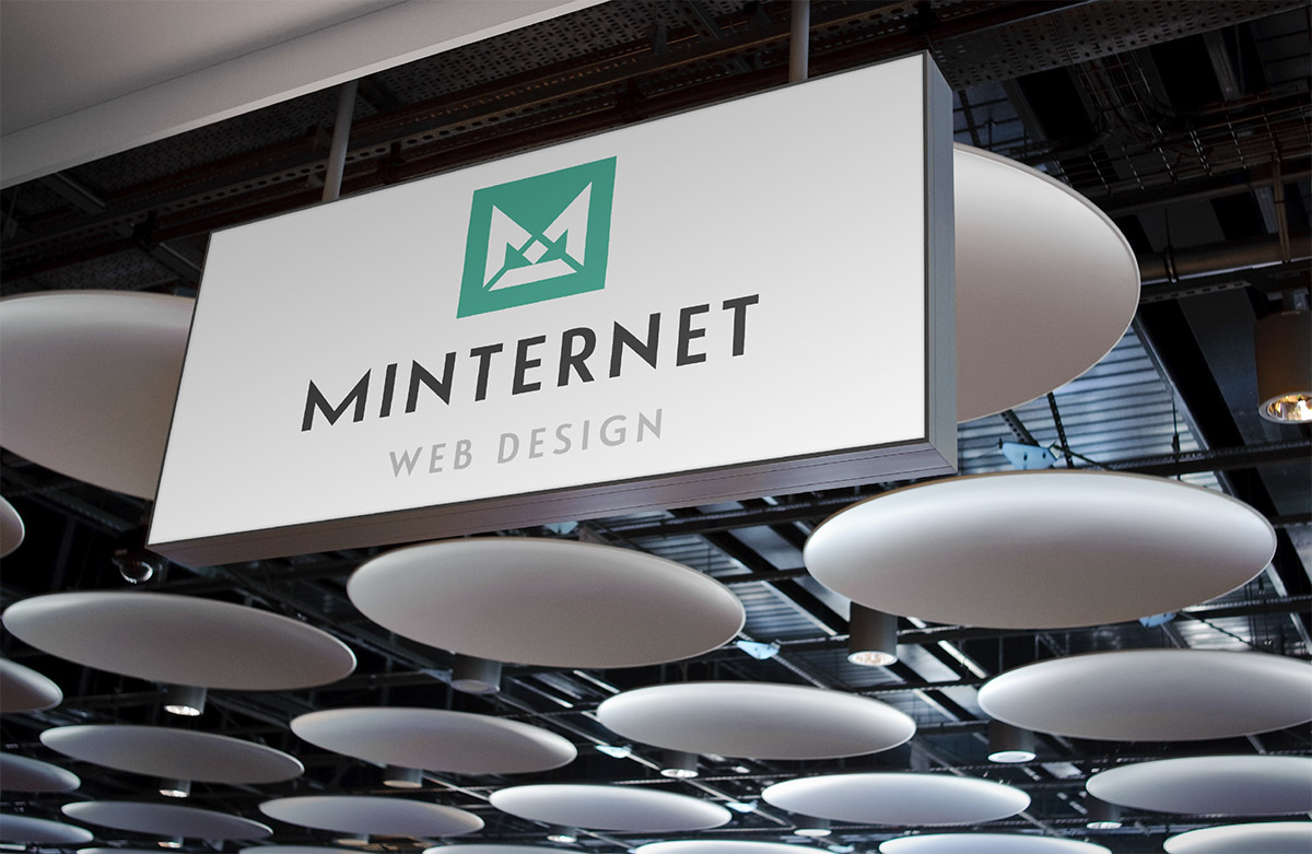
The final Minternet logo design
The final logo design beautifully encases everything which Mike believes in. It’s a logo which clearly reflects the original objectives, and is an identity which I feel confident will help Mikes business grow and succeed. It’s a confident identity, which is original and unique to Mike.
Photos of the final design are presented below.


If you are interested in my logo design service and would like me to design a logo for your business or product, please feel free to contact me by email: ian@logogeek.co.uk, or visit www.logogeek.co.uk for more information and further design examples.
If you are a graphic designer and would like some advice, or wish to share your own design process, please feel free to send me a message, or join me on twitter @Logo_Geek
Here’s a few books I recommended to learn logo design: